Dulux Colour Forecast 2021 ‘Redefine’
by Natasha Brennfleck
Dulux’s Colour Forecast for 2021 asks homeowners across Australia to redefine their homes, which have nurtured us throughout this year of unprecedented uncertainty. Bringing muted tones across aptly named palettes- Retreat, Reset, and Nourish – 2021 looks to be the year where reconnection to the home begins. Here, Melbourne Home Design + Living seeks to understand how tones and textures can redefine and reconnect you to your domestic space.

The home is now the epicentre of daily life, transitioning into the place where work, rest, and play all occur. It is for this reason that the Dulux Colour Forecast of 2021 is so important. It allows homeowners a chance to mreinvent their spaces after the year of change. “We need flexible spaces that can multi-task … to conduct our professional lives and perform household tasks, however, at the same time we need our homes to provide balance, calm and a sense of comfort and security,” says Andrea Lucena-Orr, Dulux Colour and Communications Manager.
Putting together this forecast took much international deliberation. The global effect of the pandemic had caused some disruptions; however, Dulux embraced this change when creating these neutralising colour palettes. “We reviewed many reports and studies from international trade fairs, as well as [attended] virtual design fairs,” Lucena-Orr says. Ensuring the perfect tones and palettes were crafted for Australia, the Dulux team were involved in workshops with the global association Colour Marketing Group. The process of deliberation, collaboration, and design from the world’s best colour experts has resulted in palettes that truly reflect the collective search for reinvention.
There are many differences between the palettes for 2020 and 2021, which respond to the many changes unfolding throughout the year. Inspired by nature, the 2021 forecast features warmer and muted tonalities across the three palettes, and steers away from harsh, saturated hues. “2021 differs … to last year with the increase of even more muted tones as well as more whites and neutrals,” Lucena-Orr elaborates. Seeking to
reconnect us with ourselves and spaces, the 2021 forecast encourages strength and reflection throughout the home. These colours and tones speak to familiarity and comfort. As 2020 posed many great challenges both collectively and individually, the colour forecast for 2021 is grounded in reassurance and strength.
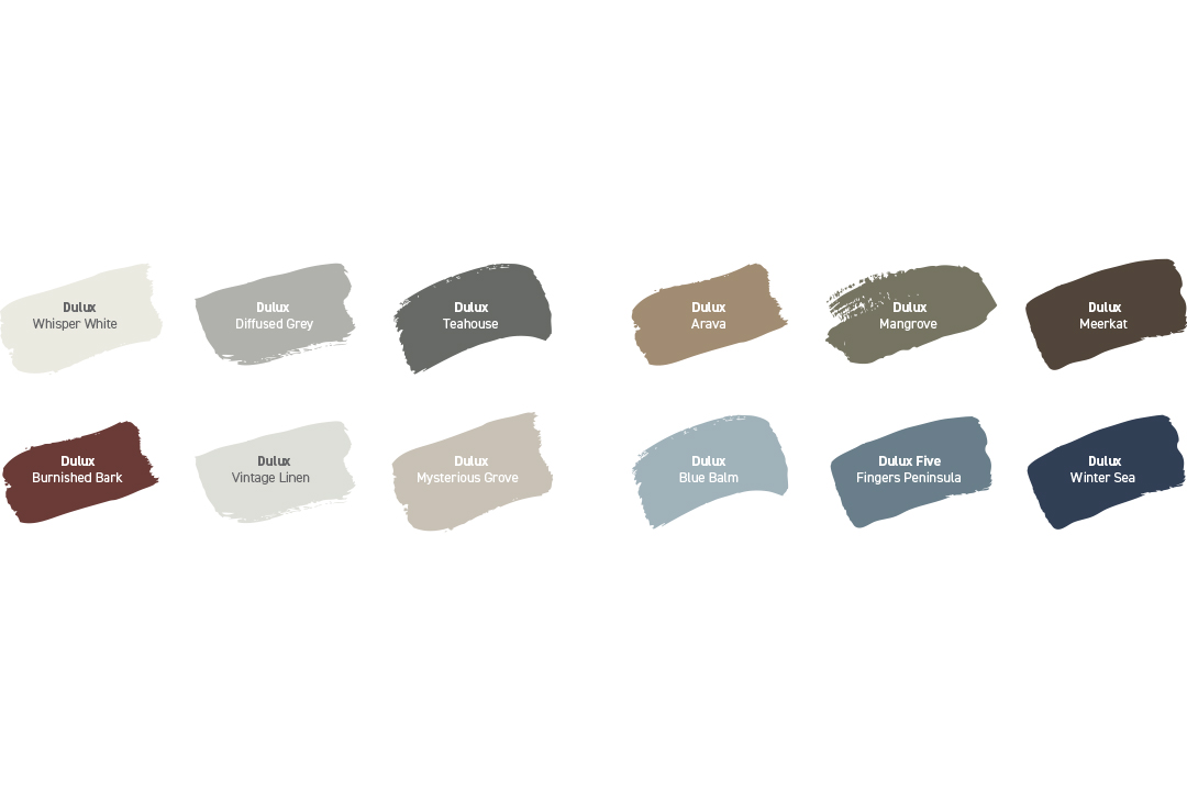
Conveying a sense of soft luxury with vintage-inspired tones of burgundy and ocean blue, the Retreat palette channels renewal and growth. Using colours that encourage sentimentality and tranquillity, the Retreat palette “[reminisces] on tradition, whilst hinting at better times to come,” says Lucena-Orr. Best styled mindfully, the Retreat palette is intended to encourage versatility and soften high-functioning spaces with soothing neutrals and silky, earthy tones.
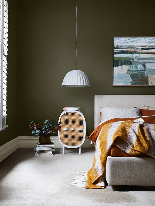
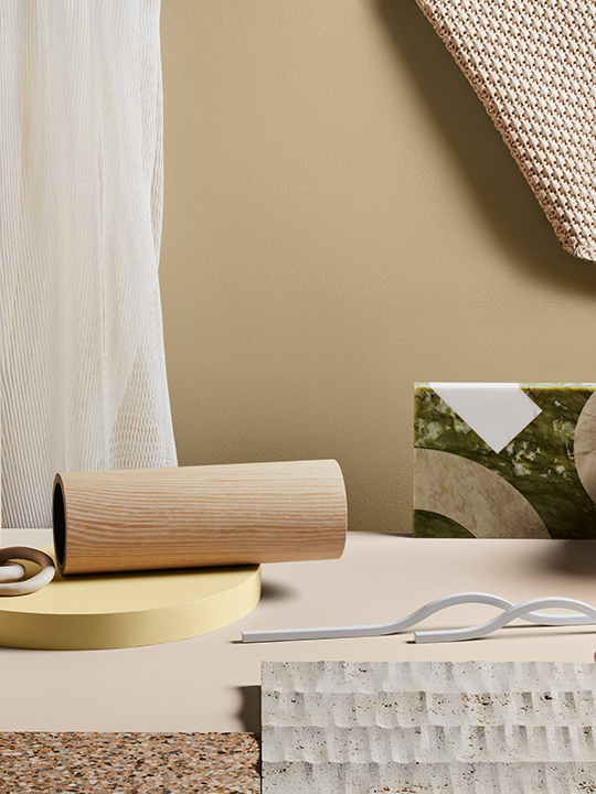
“These colours allow for moments of stillness; an opportunity to reduce the stress and digital fatigue,” Lucena-Orr says of the Nourish palette, which is full of buff neutrals and agrarian tones. With touches of tan, soft olive, and muted ochre, this palette captures a renewed appreciation for the natural beauty that surrounds us. Intended as the most grounding and subtle palette of the forecast, these biophilic hues are recommended to be used in spaces to switch off and ground oneself in the moment. Lucena-Orr suggests “[pairing] them with simple and handcrafted pieces with raw textures and matte finishes” for cohesive visual appeal.
The most uplifting and optimistic of all the forecast’s palettes is Reset, which brings bright and playful hues into the home. These colours easily revitalise and reinvent your spaces. With
rich blues and classic pastel tones like coral, pink, and terracotta, the Reset palette hints at nostalgia and looks to evoke a lightness of spirit. “As we retreat indoors, fond memories of past adventures and discoveries inspire our [homes]. Life may be slower, but there is much joy to be had in a less frantic space,” she comments. As an eclectic colour collection, this palette is the most forgiving to a variety of décor styles. Consider soft furnishings and tactile fabrics alongside this joyful palette.
“Taking inspiration from the 2021 palettes is a great place to start when choosing colour for your home,” Lucena-Orr says. These palettes are designed to refresh your space. “By subtly including one or two changes in your home, it just refreshes the environment and helps to keep it updated,” she affirms. Pairing these colours with your home and décor should come naturally, thanks to the versatility of this year’s muted and warm tonalities. Explore these shades with textured décor and fabrics – including upholstery, curtains, and rugs.
There is no denying the importance of colour for our inner wellbeing; colour inspires emotions, and humans have been giving meaning to colour for centuries. “Don’t be afraid to use colour to really help you feel the emotive and personal connection in the space,” Lucena-Orr advises. Bringing different shades into the home can help define spaces and subconsciously connect these tones with the mood of your home. The palettes of the 2021 Dulux Colour Forecast are the perfect inspiration to herald a new year of resilience, strength, and reflection.


RETREAT
As the boundaries between our professional and personal lives blur, the meaning of home has evolved into a space where we both work and find solace from the world. To navigate this transition, the Retreat palette assists in the search for balance, and is adapted for flexible spaces for our everchanging lifestyles. Inspired by homely activities such as baking, crafting and housekeeping, Retreat draws on nostalgia to create a sense of familiarity and refuge.
Influenced by nature, this palette combines the calming qualities of subdued tones. Stormy blues channel tranquillity, signifying better times to come, whilst complimentary, warmer tones bring feelings of warmth and security to the fore. This moody palette explores concepts of regrowth and development – changing with each challenge and reflecting on hardship.
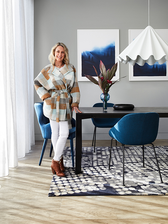
The subtle and neutral colour tones of Retreat pair well with complimentary pops of colour. Use warm-toned upholstery in soft oranges, purples, and deep blues. Opt for geometric prints to add a tasteful contrast, bringing attention to the soothing earth tones. The yellow undertones within this palette would suit a room with ample natural light – the warm tones creating a golden aura throughout your home at different times of the day.


NOURISH
Aptly titled Nourish, this palette focusses on bringing calm, stillness and reflection to our daily lives. Acknowledging the prevalence of technology in our work and home spaces, the tones in this palette reflect calm and reconnection with the self and others. With renewed appreciation for self-care to soothe the mind and create a sense of wellbeing, this palette plays into a longing for natural beauty and physical connection.
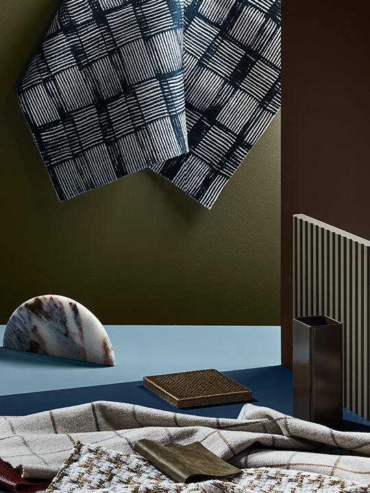
Concentrating on fleshy hues of all tones, this palette provokes a sense of physicality and connection with others in times of social uncertainty. Nourish inspires us to fill our spaces with living blooms and plants, and to reflect our inherent nurturing capabilities. Comprising of moss and sage-like greens, and muted yellows in turmeric and citrus, combining these colours with dark and leafy indoor plants will add an organic feel to the space, whilst contributing to general wellbeing during the hybridity of work and home life.
Lending itself to its biophilic tonalites, this palette pairs well with anything natural or raw. Consider pairing these colours with timber, stone, or marbled tile finishes. Do not be afraid to play with textures when integrating colours from this palette into your home. Textured surfaces and materials bring a sense of physical comfort. For a plush atmosphere bring gentle furniture or décor into the space, encouraging a revitalisation and a reconnection with the natural world – switching off from technology.


RESET
Shifting into a new year, and a new normal, the Reset palette is designed to bring a sense of adaptability and positivity to the forefront of our minds. With a recalibration of what is important, Reset looks to embrace a slow pace of living, drawing closer to our families and local communities. Inspired by colours popular in the 1970s, this palette looks to reflect on the past with optimism and embrace a bright future.
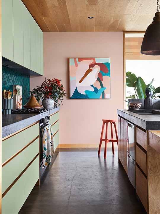
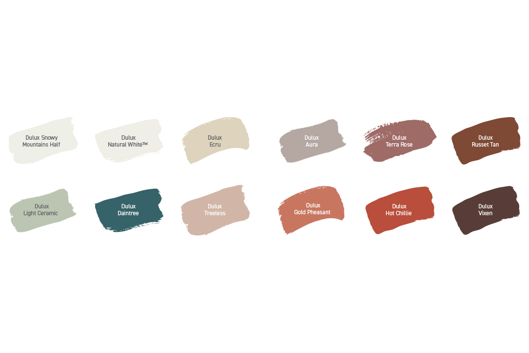
With uplifting blues and energetic reds this palette is inspired by the fun and eccentricity of a bygone era. Bringing a sense of joy and a playful flare to this palette, Reset features a great variety of hues from intense Daintree blue to Hot Chillie red. With the brightest tones in the forecast, Reset is the most daring and forward-thinking palette, as we all look to a future full of possibility. Encouraging positivity and a sense of play, this palette reflects a renewed energy and vitality for what lies ahead.
As the most bold and energetic of the three palettes, styling this palette should be a fun and freeing experience. Bring an eclectic element to this colour range by exploring a wide variety of finishes, furnishings, and décor together. The intensity of these strong colours in Reset gives permission to create loud and eccentric spaces. Bring vitality into your kitchen by utilising a bold-toned splashback, or integrate the subdued tones as a feature wall in a tranquil living space, with splashes of deep reds in decor to create visual appeal and contrast that speaks to the joy of colour.


Palette descriptions and images courtesy of Dulux.
Photography by Armelle Habib, styling by Julia Green
