Dulux Colour Forecast 2020 ‘Essence’
by Tristan Lott
Each year, Dulux’s Colour Forecast predicts the trends and styles we’ll see in colour use throughout the home. Here, Melbourne Home Design + Living unpacks the 2020 Colour Forecast. With a range of neutral shades inspired by nature and bolstered by vibrant accent hues, the four palettes designed by Dulux will inspire and invigorate home design this year.

The Dulux Colour Forecast is always inspired by what is going on in the world around us, and this year is no exception. In a time when we are constantly ‘on’ and connected to the endless stream of information coming our way, this year’s predictions encourage us to cut the distractions and create space for dreams to come alive.
The Dulux Colour Forecast encompasses four distinct and expressive palettes: Comeback, Cultivate, Grounded, and Indulge. The Comeback palette consists of an invigorating array of blues complemented by warm accent shades, whilst the Cultivate palette is a gentle and calm collection of soft greens and blues.
The Grounded palette comprises a luxurious assortment of liveable neutrals and highlights, and Indulge includes a rich selection of passionate purples, reds and browns.
Aptly dubbed ‘Essence’, the 2020 Colour Forecast calls back to the essence of what makes us happy and allows moments of personal expression. These palettes inspire us to disconnect from our digital devices, step away from the madness, and recharge our bodies and minds in a space that provides the opportunity to reflect and rebalance.
Aptly dubbed ‘Essence’, the 2020 Colour Forecast calls back to the essence of what makes us happy and allows moments of personal expression. These palettes inspire us to disconnect from our digital devices, step away from the madness, and recharge our bodies and minds in a space that provides the opportunity to reflect and rebalance. “With more focus on mental health, the wellness movement continues to gain momentum, as does an emphasis on natural materiality,” says Andrea Lucena-Orr, colour and communications manager of Dulux.
As modern homeowners are adopting an increasingly environmentally friendly approach to design, these colour schemes remind us of nature and are well matched with recycled materials and the blend of rustic features and modern styles. These palettes were designed to complement a mindful approach to design and styling. Warm, earthy materials like clay are quickly gaining popularity, while bold and bright colours are being used in smaller doses as feature walls and accents. Neutral tones are favoured throughout the home, pairing well with natural materials such as stone and timber.
The home is somewhere we go to recharge and relax; a distraction-free zone that allows us to centre ourselves and celebrate our true personality. The Comeback palette is equally fresh and energising. Full of rich oceanic and mineral-inspired shades paired with interesting accents of burgundy, rust and clay to add depth.
Of this palette, Lucena-Orr says, “there’s a lightness and fluidity to the ocean tones… while the warm, earthy shades add cosiness.” This palette is designed to fuel creative thinking and lends itself well to unique styling. “It’s the ideal backdrop to combine furniture from different eras – from mid-century through to the 80s,” Lucena-Orr says.
The Grounded palette uses a ‘less is more approach’ by combining gentle and complementary neutrals with touches of warm coral. Conveying a sense of luxurious, understated beauty and timelessness, this collection reflects the shift in our values towards craftsmanship and honest design. Pared-back and uncomplicated, Lucena-Orr tells us that Grounded reflects the need for a more tonal palette in 2020. “It has a soft, neutral feel that creates a sense of relaxation in a space, with fold and coral adding touches of luxe.”
We’re increasingly aware of the positive effects of nature on our physical and mental wellbeing, and the Cultivate palette introduces a new and creative way of bringing nature inside. A calming variety of greens from olive and pistachio to forest green and emerald, this palette is full of colours and textures that are “easy to work with and have a warmth that really conveys the essence of home,” says Lucena-Orr.
Beautifully suited to raw timber, natural stone and cool glass, this array of colours is a celebration of nature.
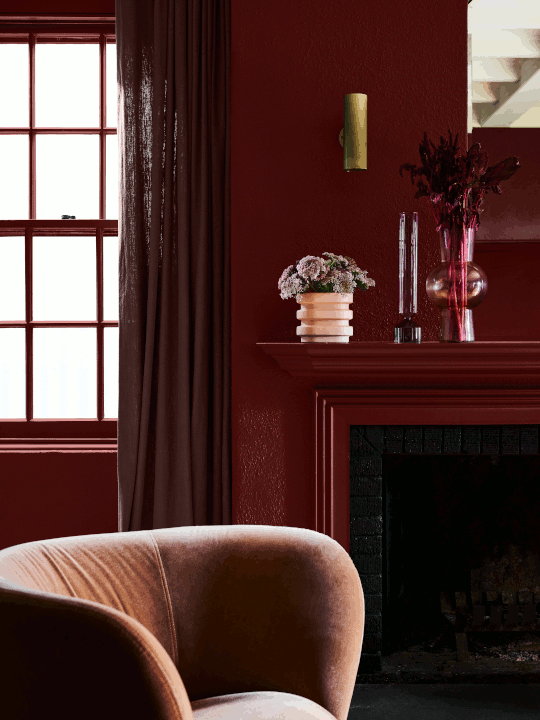
Decadent and rich burgundies, eggplant and brown are softened by faded terracotta and coral in the Indulge palette. “This palette is not for the faint hearted,” warns Lucena-Orr. “It’s dramatic and exciting and is guaranteed to add wow factor to a master bedroom, dining room or living room.” Choosing to accent pink in dusty rose and tan shades, the Indulge palette modernises what has been a key colour of the last few years. These tones can be easily paired with nostalgic 1970s and art deco aesthetic; a great way to reflect personal style in your abode.
Paint is an easy, affordable and effective way to revitalise any space. The Dulux Colour Forecast 2020 introduces some new and exciting ways to create a dwelling that invigorates and excites, allowing you to disconnect and recharge. “Trends can be a useful roadmap when choosing colour,” Lucena-Orr says. “Once you’ve lived with colour, you never want to return to a blank canvas.” Whether you wish to completely reinvent your home or want a change but feeling stuck for inspiration, the Dulux Colour Forecast 2020 is sure to kickstart your research and provide some great motivation for bringing more of the essence of what makes you feel good into your home.


COMEBACK
Intimate, individual spaces reflect our identity, interests and passions. The Comeback palette features vibrant blues, contrasted with warm burgundies and eye-catching rust and mustard shades. These vintage hues create a space for storytelling and escape, and contrast the monotony of day-to-day life by creating revitalising spaces.
Looking to the past for inspiration, this palette was cultivated by mixing styles of different eras, from funky, mid-century design to the vibrancy of the 1980s. The result is an attractive collection of bold and confident shades, well-suited to antique, vintage and contemporary styling. Refined and elegant shapes are highlighted while typically heavy angles are softened, this palette is especially complementary to rich velvet furniture and vivid accents.
The vibrancy of these colours makes them well-suited to become feature walls that can help to divide an open-plan space into distinct zones. Picture the outstanding ‘Master Blue’ as a feature in your living space, paired with warm accents of ochre and clay. For something different, ‘Misty Grape’ and ‘Tort’ make for an intriguing pair in your bathroom with funky towels and lush greenery to create an eclectic vibe.


CULTIVATE
Bringing the outside in, the Cultivate palette brings awareness to the relationship between nature and our wellbeing. Seeking innovative ways to encourage connections with the natural world within our home, we fill our space with plants, botanical prints and furniture crafted from natural materials such as timber and stone. The home is now not only a place to rest and recover, but a space to inspire and flourish.
Echoing the infinite hues found in nature, this palette layers delicate greens with chalky blues, deep plums and even soft yellow shades to rejuvenate and inspire your home. Full of complementary tones and textures that radiate subtle warmth, this selection was made for home enthusiasts.
Using green tones throughout your home establishes a unique and soothing ambiance. Pair these natural shades with industrial accents and dark timber to introduce stunning contrast. While these hues are effective throughout your home, try ‘Te Aroha’ or ‘Pencarrow’ in your kitchen and meals area to add a sense of calm to what can often be the most chaotic part of a home.


GROUNDED
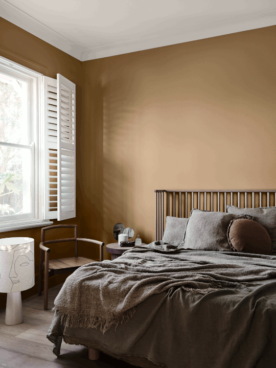
This palette was crafted to reflect the changing definition of luxury. Modern homeowners are associating luxury items with craftsmanship, longevity, authenticity and understated beauty, and thus this palette is built with soft, liveable shades. Mindful of the purchases we make, the ‘less is more’ philosophy has never been more popular. Recycled and repurposed materials are highly sought after as we fill our homes with soft leathers, tactile linens and honeyed timbers.
From melted caramel and pale biscuit shades to muddy lavender and hints of terracotta, this palette is full of colours that are well-suited for use throughout the home. Accents of gold and coral make for bold highlights, but the overarching subtlety of this palette gives it universal appeal and a sense of timeless luxury. This palette is versatile but can effectively create a calm atmosphere in your living spaces and bedroom. Pair these soothing shades with soft linen and buttery leather, and take inspiration from the lively coral of ‘Gold Pheasant’ and brown tones in ‘Fantan’ and ‘Pancake Mix’ for feature accents like rugs and pillows.


INDULGE
The Indulge palette is rich and lush, reminiscent of 1970s disco with art deco touches. Motivated by a desire to escape, this palette was designed to help create spaces that keep dreams of travel and adventure alive. Dramatic and romantic shades are equally suited to soft velvet and chenille, curvaceous furniture and touches of bling, as well as the frayed edges and time-worn finishes that are popular today.
From rich burgundy and eggplant to earthy brown, faded terracotta and soft coral for warmth, this palette is full of passionate shades to excite any abode. This range of indulgent shades is hard to resist and is the perfect choice for adding drama and inspiration.
Lush and decadent, play with jewel-tones like ‘Camellia’ and ‘Red Rebel’ to create an indulgent living space that exudes luxury. Soften the bold atmosphere with retro accents and soft, rounded shapes in shades like ‘Lilac Light’ and ‘Unbleached Calico’. The similar undertones in this palette make it easy to mix and match – play with patterns in these complementary hues to create a striking statement.


Palette descriptions and images courtesy of Dulux.
Photography by Lisa Cohen, styling by Bree Leech.
